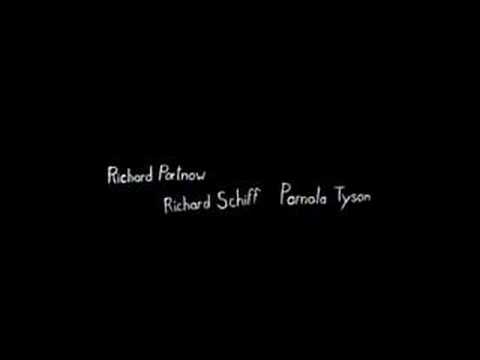
For our titles, we have decided to use a child-like font; a font which looks like it has been scribbled in roughly. This is in keeping with our idea of a psychological thriller, as the state of the protagonist's mind is unstable, which is reflected in the unstable handwriting used. Also, we will use a sans-serif font which will be more likely to appeal to our younger audience (16-30) rather than the older generation (in which case a serif font would be more appealing.)

 Inspiration for this idea has come mainly from the idea of the deranged little girl who will be the protagonist in the movie, but also from the font used in the opening sequence of the film 'Se7en'. I think this type of font is perfect for our thriller as it symbolizes both youth and an unstable mind, which is exactly the type of message we want to get across to our audience.
Unlike 'Se7en', which uses titles on a blank screen as well as on top of the picture, we will most probably use the titles on top of the picture as it will save more time and not make the opening drag on too long. However, we might experiment with flickering words and background behind the text to make it more effective and to tie in with the rest of the opening sequence.
No comments:
Post a Comment